Friday, 30 March 2012

Re-filming and Editing after feedback from our Rough Cut

After collecting feedback we carried out our final lot of filming. We firstly designed a schedule so we knew exactly what to do, before driving after to school to Ellie's house.

Filming Schedule

Editing
We then edited our music video to complete the music video. This included inserting and altering the new clips we have filmed as well as making the changes I identified in a previous post.

Zoe and I editing in the media room

Adding Transitions
Part of our editing involved adding transitions to make clips flow well and so as before we added a 'cross fade' effect which makes two adjacent clips blend into one other as the clip changes.


We used this when inserting the clip of the flame from the lighter which we wanted to be quick and faded, so it would flow into the next clip smoothly.

Adding Markers
'Markers' can be placed on the timeline in adobe premiere and basically mark that time in the music video with a white block. This was good in helping us cut the clips to the beat as we know where each beat is and so where the clip should change. We used it when Ellie walks to the camera and it cuts 3 times showing her jump forward on the beat:


Tuesday, 27 March 2012

Feedback about Magazine Advert

We showed our magazine advert to our media class in order to receive feedback:

  • A good link between the red lips and red font for the song name
  • The size of the date attracts the attention of the audience so they know exactly when the song will be released.
  • The image of the CD is the same as that on the front cover of the digi-pack so the audience can link these two products easily.
  • The ratings from magazines are realistic and easy to see.
  • Though the same image is used on both the magazine advert and cd cover, more is shown on this product making it slightly different.
Areas for improvement
  • Maybe add a record label logo onto the advert.
However, our research into magazine adverts has shown us that they commonly do not actually show the record labels logo and therefore we will consider not adding this.

    DIGIPAK

    Spine of the Digi-Pack

    Lastly, to complete our digi-pack we must add a spine and so have decided to make it quite simple and show the artists name and album name only, as done on many albums:

    1) Using the height from the album front cover, we created a new document, estimating the width of a spine, from the previous research we had done into it.

    2) We wrote the name of the artist and album on the spine, with the text box tool, using the fonts we had used on the digi-pack front cover.


    3) On the back cover we had added two dots either end of the information about her myspace account etc and so thought it would also look good on the spine:


    However, after moving these dots around, using a trial and error method we eventually decided the original look was more professional.

    THE FINAL PRODUCT


    Monday, 26 March 2012

    Developing the digi-pack

    After collecting feedback from our media class, we thought of possible ideas for behind the CD in the digipack:

    (Click on to enlarge)

    After discussing the options within the group we have decided to go with a message from the artist which will say 'Love Elle x' as this should appeal to the individul audience members who buy the CD and seem as if she has signed it herself.

    Above are two versions of a very similar design. Charlotte created the first, however, we felt it looked a bit too straight and typed rather than the signature appearance we were going for and so instead tilted the words to the left slightly. Each member of the groups likes this design and feels it is more attractive than the previous plain background we had designed.

    This also links to the CD in the Kesha digi-pak which we have focused a lot of our research on:


    The CD on the left shows the background with a consistent pattern of the artists initials while in a more obvious font is the artists name in its iconic font. Ours is similar in the way that the CD itself also has a repitive pattern and the artists name is also seen but under the CD rather than in addition to the other detail on the CD itself.


    The back of the CD is now linked with the album front cover, as seen above.

    Feedback on our Digi-Pak

    We collected feedback from our Media class, as well as given the other groups our opinions on their work. This gave us a chance to see how the products were perceived and if there are any changes we should make.

    Saturday, 24 March 2012

    Feedback on our Rough Cut

    The rough cut my group produced was our first draft of the final cut and we therefore aimed at making as few changes as possible. To gain feedback we showed our media class who provided us with positives and negatives they saw in it.


    Tuesday, 20 March 2012

    Theorists

    Sarah Brushett and I presented to the class about two theorists we researched. We can therefore use our findings during the evaluation of this coursework to see how well it meets these theorists views.


    Making the Magazine Advert

    1) We agreed that the best idea for our magazine advert was to use the same picture on both the digi-pack and magazine advert because our research had showed this was clearly very common. However, we felt it would be more interesting and different to place the picture differently and so have put it on the left hand side, rather than the right as it is on the digi-pack. Showing a close up image of the artist also links to the research I have done on a Rihanna magazine advert which uses the same technique:

    Our image

    Rihanna Advert Image


    However, the image was not originally this large, with a gap on the right hand side and so we had to edit it to make it bigger to fit the information on:

    (click on to enlarge)
    2) Adding the name of the artist and song. We used the same font to incorporate synergy in the products as this will make it easy for the target market to identify as one of the artists products.

    4) Adding other features to the magazine. My post called 'Magazine Advert Research' shows labelled posters which shows typical traits of magazine adverts which we felt we should include on our magazine advert.

    Ratings from well known brands

    The stars are ratings from a well known magazien (Q) and radio station (Radio One), reflecting their views on this album. This can be seen in many magazin adverts for example:
     

    Date of album release

    In a large font we added the date of release along with the words 'the debut' to inform the audience that it is her first album, letting them know something more about it. It is large to attract the audiences attention immediately.


    Adding an image of the album cover

    We added an image of the finished digi-pack cover to the magazine advert so the audience can link the two.

    Information about contacting the artist


    Below the name of the song is some information to show the artists myspace, twitter and website.

    With all of these qualities added we have come to a final product:

    Sunday, 18 March 2012

    Designing our magazine advert

    I have looked through various magazine advert examples and Zoe and I had created a few designs but had not included on these all features that we have later found are common on all adverts, such as:

    - Ratings from magazines/ singers/ radio stations
    - Contact information
    - Release date

    Therefore, as a group we thought up a final idea for our magazine advert:

    When we create the final thing of photoshop, however, we may change around certain parts, for example where we show the ratings or image of digipak.


    Wednesday, 14 March 2012

    Which Music Channel Would We Use?

    Once completed, we may add a logo to our music video to show which channel would promote it. I have done inital research into music channels and discovered that an MTV channel would be suitable as they play all genres of music.

    animated gif maker

    In addition, the target group for MTV is generally 16-30 which would meet the target group we are aiming at of people in their late teens or early twenties. Out of the selection of channels, MTV rocks is definitely the most appropriate channel as it fits the genre well.

    After considering adding a channel, we have decided against this as the television station itself would insert the channel logo in the corner rather than it being permanently visible on the music video.

    Developing the back cover

    Though the back cover is basically finished, we felt the image was a bit too bright and vibrant in comparison to the front cover image and therefore Zoe and I decided to re-edit it to make the two images link better and promote synergy throughout the product.

    Therefore, Zoe and I took the original image and began editing again. We reduced the vibrance and make it brighter but not as bright as it was above. As Charlotte had before, we lasso'ed the eyes and lips and made them into layers so they would stand out and be the main focus of the image, meaning consistancy throughout the digi-pack.


    FINAL BACK COVER


    Tuesday, 13 March 2012

    Digi-pack Back Cover

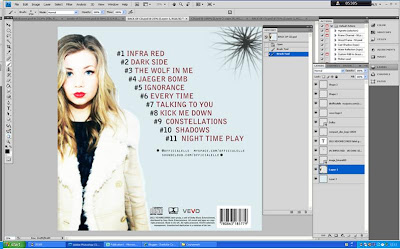
    Contructing the back cover of the digi-pack:

    1) Firstly, Charlotte took the image we had decided would work well on the back cover and edited it to make it match that on the front cover. We also moved it so only two thirds of the image can be seen. We thought this would be appropriate as the front cover also shows only a portion of the girl, while if it was in the middle of the page there would be no space for the songs to be written. From research we have seen that album covers include logos such as the 'vevo' and 'dolby' ones and so Charlotte inserted these onto the cover, along with a barcode.


    2) We then decided song names as group, thinking of typical names that could easily be seen on a CD but that also linked well with the style of 'Elle'. For each song name it is numbered as #1, #2 etc. Charlotte planned the # which means number and we all agreed this was an interesting and effective way to present the songs.

    3) Next we added information beneath the song names where it says contact information for the label, including a website and the twitter account of the artist, which is commonly seen on the back of albums. 

    4) The space in the top right hand corner looked quite plain and empty and so we tried out a few ways to fill this space, including a sort of star shape as seen below. However, we felt this did not look very professional and so decided against it. 

    Constructing the CD

    After constructing our front cover and inside of the front cover we have moved on to the CD itself. As a group we discussed various designs for the CD which we felt would link well to the rest of the digi-pak and then Charlotte created the following designs using Photoshop:


    1) Firstly, we all felt that a large pair of lips was a good idea as many CD's are quite basic, as this idea is. It links to our research on Rihanna's CD and the idea of using a rose. It also keeps the CD linked to the front cover, where a large focus was on the bright red lips against a less vibrant surrounding, as you can see below:


    We then felt maybe adding the artists name and album name above the image of lips would make the CD more interesting and less plain, however, this is rarely seen on CD's and did not look very professional so we have consequently decided against it.

    2) The next idea we had was for the name of the album 'ignorance' to be written across the CD several times to cover it, linking to Kesha's CD. However, we felt this did not look very exciting or interesiting and therefore thought maybe adding lips begind the writing would improve this. We decided against this though as it is unclear what the picture behind actually is with so much writing across.

    3) We decided that the lip image was a good idea but just not in the format it was before and so came up with the idea of smaller lips making a pattern across the CD, combining the ideas on both Rihanna and Kesha's own CD's in their album digi-paks.. The CD is now not plain and links with the front cover of the digi-pak. In addition, we selected the background colour from the front cover and made the CD background this colour to keep a consistant colour scheme.
    Lastly we had to make the 'behind the CD' section which we have decided will be a plain blue background as it will mostly not be seen and this is commonly done. This can be seen in the image above.

    Sunday, 11 March 2012

    Adding Effects

    Using my previous research into how music videos show the changes between the present day and the past, my group felt the best way to show this change was a colour change between the two times.

    Colour Replace


    Zoe and I firstly tried out the 'colour replace' tool which means you can tint the clips a different colour. We thought blue would suitable as it is a cold colour and shows how she feels bitter about her life changing to how it is, however, this tool made parts of the shot bright blue and others did not change, so it did not look how we had planned. We consequently decided not to use this tool.

    Black and White


    Next we tried out the 'black and white tool' which we believe is the best option. It clearly shows a difference between the past and present but also makes the shots very clear to see. Without the colour, it also looks less lively compared to the present, showing a contrast between the calm in these scenes and the chaos of the others.

    Cuts and Transitions

    After inserting all the clips to the timeline and cutting them to the correct points, we had to add shot transitions and effects so that:

    - It runs smoothly
    - The story is easy to understand
    - It is clear which parts are flashbacks to the past

    I have previously done some of my own research into transitions and cuts and where these are appropriate, for example based on the song tempo and have also looked into different approaches music videos take to show a time difference and taken this all into consideration.

    cam to gif

    The above two shots show the transition in action. Zoe and I decided through trial and error that the best transition to use was the 'Cross Dissovle' as this slowly blends the two shots. In my previous research into musci video transitions, I found this was a fairly commonly one used. In addition, these two shots had to be clearly separated as they show a time difference between the past and present. Therefore, a more obvious transition should make the audience more aware of this difference.


    At the end of the film, we decided to make it fade out. We tried firstly doing this slowly, however, the way we have edited the film means the film carries on slightly longer than the song to add impact on the girl being thrown out. Therefore a long fade was inappropriate as there was no music and so it made the ending too long-winded. A short fade however ended it wuite quickly, but not too sudden making it suitable.

    Another issue we had was the length of the music video was set as the original lenght of the song. However, we had cut short parts out of the song, being the film continued for about 20 seconds without any music or film. To cut this down we dragged the 'marker' closer to the end of the film, meaning there are now just a couple of seconds following the end of the song.

    Editing to Fix Problems

    After inserting all the clips to the timeline, we were able to watch the entire music video run through. However, whilst doing so we did notice a few issues we wanted to address in order to:

    -Make clips easier to see
    -Ensure the colour/ lighting is consistent throughout

    Image Control


    One of the main issues we had with the film was the difference in colour between the all shots compared with the final scenes seen above. The colour was quite bright and orangey and so we used the 'image control' editing tool and reduced the saturation levels.

    Brightness/ Contrast


    The next problem we had noticed was that the shot seen above was darker than the others due to the camera facing the light window which meant the figures when in front of this light were slightly shadowed and hard to see. Consequently we used the 'brightness and contrast' tool to lighten the shot. By adjusting brightness we had to be careful not to make it dull and hard to see and therefore had to adjust contrast also in order to keep the two fairly balanced.

    Gamma Correction

    
    We discovered the gamma tool has a similar effect on the shots as the brightness adjust, making the shot brighter and so increased this slightly on the same shot as before, when Ellie walks through the front door.

    Horizontal Flip

    Lastly, I noticed that the picture Ellie burns, which is then shown in a flashback being taken, is flipped round because the iPhone screen shows a mirror image. Therefore the flashback did not link directly to the picture being burned as the two characters were shown in the reverse order on the screen. Using the 'horizontal flip' tool, we managed to flip this shot and so it flows much better.

    Inside Cover of Digi-Pack

    Charlotte took one of the pictures from Zoe and my photoshoot of Ellie which she believed would be appropriate for the inside cover the digi-pack:


    We all felt this picture is quite different and exciting and consequently shows a different, more wild, side to the character. As apposed to using a basic, mid-shot image which had initially considered for the inside cover, we felt that using this would be more interesting and links to typical media products, such as the inside covers of Rihanna and Kesha's albums, which is shown through my research. In addition, though it does not show the while head fully in the shot, this was the aim and it still shows the lips and eyes which are the most obvious, main focus on the front cover, therefore keeping it linked.


    The main issue with this picture was the fact that the background white sheet did not cover the entire background and part of my bedroom can be seen behind. Charlotte therefore edited the image to hide this part of the image, using the clone and rubber tools, giving it a suitable background.

    After editing the image, we agreed the same font as on the front cover should be used on this page. There did not necessarily have to be text as the inside page of CD covers are often quite basic, however, we did not want it to look boring and so quoted a line from the song 'ignorance' which the artist sings several times:


    A similar idea was used on one of Kesha's albums showing only text on the inside cover but we have incorporated this idea into our current product.
    In addition, we kept the font consistent by writing it in the red colour of the lips which makes it stand our against the coat. After writing it out, Charlotte felt that the word 'ignorance' should be slightly bigger than the rest of the sentence as it is the name of album and therefore wrote it in a bigger font.

    FINAL DESIGN